 WhatsApp Us Now
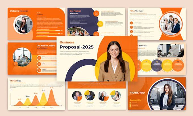
Whether you’re pitching a bold new idea to your boss, addressing an industry conference, or presenting results to clients, your slides play a vital role in shaping your message. Great design isn’t just about making slides look pretty—it’s about clarity, persuasion, and emotional connection. A poorly designed presentation can confuse your audience, dilute your key points, and ultimately undermine your credibility. The good news? You don’t have to be a professional designer to craft slides that wow your audience. Here are ten proven tips to elevate your presentation design and keep your audience engaged from start to finish.
1. Start with a Clear Structure
Before you even open your presentation software, map out the flow of your content. A clear structure helps guide your audience and ensures your message lands effectively. Start by defining your objective: what do you want your audience to know, feel, or do by the end? Outline your key points in logical order, and limit the number of sections to avoid overwhelming viewers.
A classic structure—introduction, main content, and conclusion—works for many topics. Within each section, group related points together and use headings to signal transitions. This makes your presentation easier to follow and keeps your design aligned with your narrative.
2. Embrace Simplicity
Simplicity is the cornerstone of effective presentation design. Busy slides packed with text, charts, and graphics can distract and fatigue your audience. Instead, focus on what’s essential. Use concise bullet points, short phrases, or single powerful statements. Think of each slide as a billboard: the message should be clear and immediate, even at a glance.
White space is equally important. By leaving space around text and images, you guide viewers’ eyes to what truly matters and create a modern, uncluttered look. Remember, less is almost always more.
3. Choose Consistent Visual Themes
Consistency in fonts, colors, and graphic styles helps your presentation look polished and professional. Decide on a color palette that reflects your brand or message—ideally three to five complementary colors. Use one or two fonts throughout: a clean sans-serif for headings and perhaps a serif or different weight for body text.
Align images, text boxes, and icons to a consistent grid to keep slides balanced. If you don’t feel confident designing these elements yourself, consider working with a Presentation Design Agency to create custom templates that you can reuse for future decks.
4. Use High-Quality Visuals
Visuals are powerful storytelling tools—but only if they’re clear and professional. Avoid low-resolution images, clip art, or visuals that feel generic. Instead, invest in high-quality photos, illustrations, and icons that match your message and audience.
When using charts or graphs, ensure they’re easy to read: use clear labels, remove unnecessary gridlines, and highlight key data points. Visual hierarchy also matters; emphasize the most important elements through size, color, or placement.
5. Make Text Readable from Any Distance
It’s surprising how many presentations use tiny fonts that are impossible to read from the back of a room. Aim for a minimum font size of 24–28 points for body text, and even larger for headings. Use high contrast between text and background—dark text on a light background or vice versa.
Also, avoid long blocks of text. Break complex ideas into multiple slides if necessary, and use visuals to illustrate your points rather than explaining everything in words.

6. Leverage Visual Hierarchy
Visual hierarchy guides your audience’s eyes through each slide in the order you intend. Larger text, bold colors, or central placement naturally draw attention. Subtler elements can support your main message without competing with it.
For instance, your slide title should generally be the largest text element. Supporting points can be smaller and positioned lower. If you use icons or graphics, keep them proportional and make sure they don’t overshadow your key message.
7. Tell a Story
Facts and data are important, but storytelling makes them memorable. Instead of simply listing points, frame your presentation around a narrative arc: introduce the problem, explain why it matters, present your solution, and finish with a call to action.
Visuals can help tell this story—think progression graphics, timeline slides, or before-and-after comparisons. Stories humanize your data and make complex information easier to digest.
8. Use Animations and Transitions Sparingly
Animations can add life to your presentation, but too many can distract and look unprofessional. Stick to subtle effects like fades or wipes that enhance flow without stealing attention from your content.
Use animations intentionally: for example, revealing bullet points one at a time to match your speech, or zooming in on a key data point. Avoid flashy effects like spinning text or bouncing graphics—they often feel dated and can detract from your credibility.
9. Match Your Slides to Your Speaking Style
Your slides should complement—not compete with—your delivery. If you plan to speak freely, design slides that act as visual prompts rather than scripts. Use images, keywords, or diagrams that you can elaborate on verbally.
If your presentation will be shared without narration, include enough context on slides so readers can understand your message on their own. This balance is key to keeping your audience engaged whether they’re listening live or reviewing later.
10. Practice and Refine
Even the best-designed slides need testing. Rehearse your presentation to check timing, flow, and clarity. Ask colleagues or friends for feedback: do the slides feel clear and engaging? Are there any confusing visuals or text-heavy slides?
Adjust based on feedback. Often, the first version of your deck is too long or includes unnecessary detail. Editing ruthlessly—cutting content that doesn’t support your core message—results in a sharper, more compelling presentation.
Why Good Design Matters
Stunning presentation design isn’t just about aesthetics—it directly affects how your message is received and remembered. Research shows that people retain more information when it’s presented visually, and audiences are more likely to trust a speaker whose slides look professional.
A clean, consistent deck makes you look prepared and credible. Clear visuals help you explain complex ideas more easily, while effective use of storytelling and hierarchy keeps your audience engaged throughout.
If design isn’t your strength or you’re preparing for a high-stakes pitch, partnering with a Presentation Design Agency can be a smart investment. They can help turn rough ideas into sleek, persuasive decks that elevate your message and strengthen your brand.
Putting It All Together
Creating a stunning presentation is about more than just colors and fonts—it’s about clarity, storytelling, and audience connection. Start with a strong structure, keep slides clean and simple, and choose visuals that reinforce your message. Use hierarchy and animation carefully, and always test your deck before you present.
Remember: great design doesn’t overshadow your content—it amplifies it. Whether you do it yourself or collaborate with experts, investing time and care in your presentation design can make the difference between a message that’s forgotten and one that inspires action.
By following these ten proven tips, you’ll be better equipped to craft presentations that not only look impressive but also deliver real impact. Your audience—and your future self—will thank you.


